USER EXPERIENCE, USER INTERFACE, VISUAL DESIGN

THE PROBLEM TO SOLVE
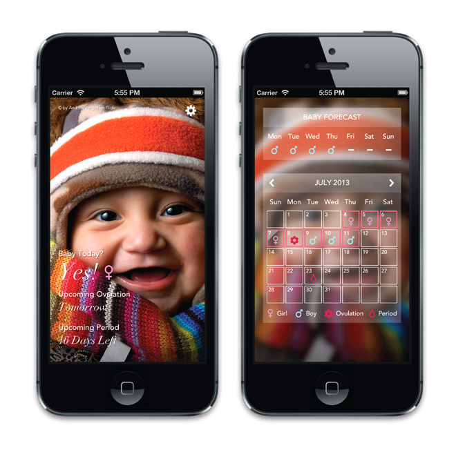
While some women conceive and fall pregnant quickly and easily, for many women the process can be frustratingly slow and painfully emotional. There are quite a few ovlulation/fertility tracker apps in the app store to help women increase their chance of conception. However, none of them has kick-ass design. Instead, they are hard to use, glitchy and not visually appealing. I challenge myself to make a fertility app that is not only simple to use but also visually engaging. I was lucky enough to find a technical co-founder who was also interested in solving this problem. So we partnered up to make this happen!
RESEARCH
To begin with, we did some reserach to understand what are the dates in menstrual cycles that have highest chance of conception. We also asked our friends and co-workers who were trying to conceive what other tools or apps they were using for conception. So we got a better sense of what works and what doesn't work on those apps.
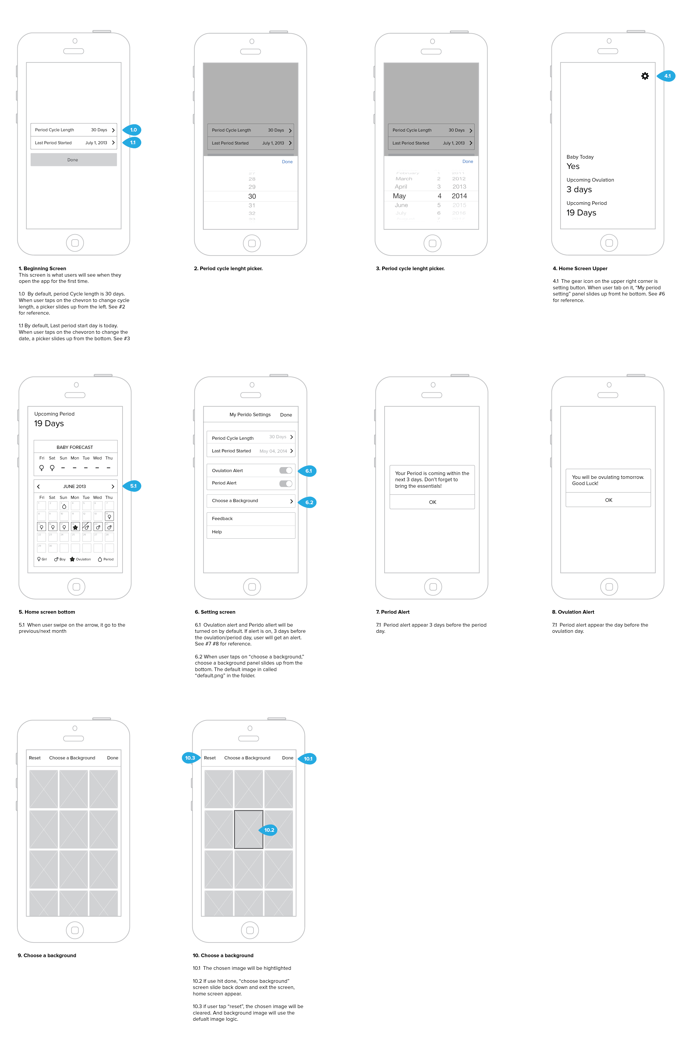
SKETCHING AND PROTOTYPING
The project was moving very fast. I sketched out the ideas on paper and showed them to my partner. We worked together to think through the interaction details. Once we agreed on the concept and the interaction, he started building a prototype while I was polishing the visual design.
SHIPPING AND ITERATING
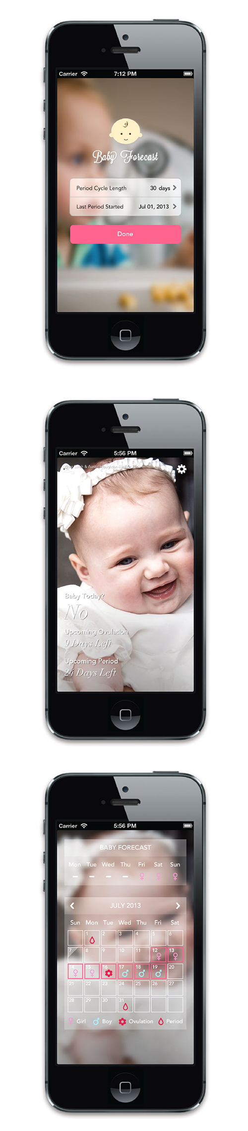
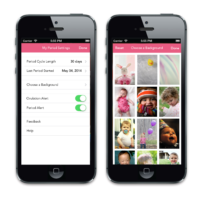
It took us 2 weeks to build and ship the MVP of Baby Forecast. It is now available in app store for $0.99. The app has been featured in the top 50 of the medical category in the iOS app store. After the product released to the market, we added new features like "period alert" and "change the background" to the product based on user feedback.


